So you have decided to create your first handwritten font, not only that you want to make something unique, something that you can call your creation, your first handwritten brush font. Before you start you need to get your head around some basic knowledge.
1.Start with thinking / doodling
Handwritten fonts come in million different shapes and forms, here Espa Extened – our latest brush font, and its a really good example. So before you get going you need to figure out what kind of style your own hand writing is most natural for. For me it’s always important to look for something new, something that is my own handwriting. When i look for inspiration i tend to find myself browsing architectural structures and unsplash. Nature with it’s unpredictability and architecture with it’s clean shapes form my main inpirational source.
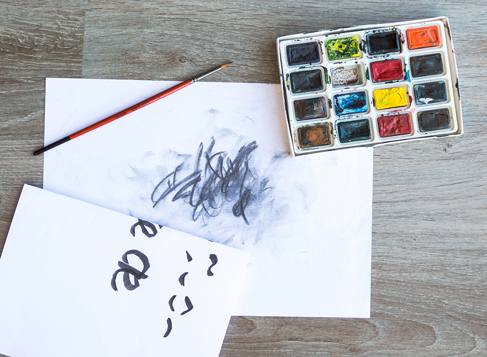
2.Brushes and colour
You don’t need fancy fancy fude pens that cost up to 100$, if you want a decent looking handwritten font you can create one using the most simple synthetic brushes found is artist shops. I have created fonts using even brushed found in household shops. So try drawing letters with the brushes you already have, and if the result does not make you happy, go out there and get different ones. I use simple synthetic brushed that i bought in one of my local artist shops.
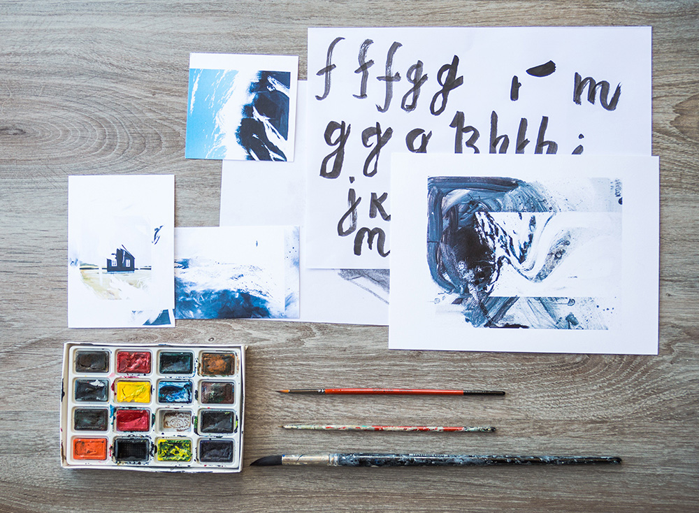
3.Get starting on the alphabet
If you are older than 8 then you probably have learn the alphabet, and know what letters you have to draw, if not than look at your keyboard. It will have the basic characters a font needs to be called a font. I usually start with the letter a and go through each letter. Drawing each letter as many times as i need to get the result i want to get.
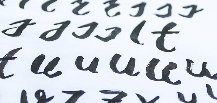
4.Try getting a smooth consistency
After you have made decided a style you want to create you have to strive for consistency . Avene Pro has one of the best handwritten consistency we have created. All the letters need to look alike. They have to be siblings, otherwise it will look weird when some of the letters stand out from the crowd. Good and clear consistency makes a typeface work fluidly and affect its readability massively.
5. Get the font together
Now that you have all the letters you want drawn, you have to take your camera and good find a good light place to take photos of all your letters. Than you put the images in illustrator and pull out vectors from the letters.
After that you have to get one of the apps for font creation , just search google to find some. Than you copy letter by letter from ilustrator to your font app. After all the letters are in the font app you just have to export the font and there you are. Your first font is made.
Recent Comments